Remarkable 2 review: all the right notes
Still arguing the case for simplicity
Despite launching three years ago, the Remarkable 2 is still the E Ink slate to beat for many, even after the launch of Huawei’s MatePad Paper, Boox’s Onyx series, Kobo’s Elipsa and most recently, Amazon’s Kindle Scribe. But why is the proudly unsmart Remarkable 2 still so well-regarded? A big part of that comes down to updates.
Remarkable has been rolling out software improvements consistently since 2020, and it’s even updated the accessory line over the years too, with the latest launch for March 2023 being the TypeFolio cover.
Long-requested features like cloud backup and an app for Android, iOS, MacOS and Windows have been added, so you can access your notes across devices. The interface has also been overhauled, with pinch-to-zoom support, cut and paste, new brushes, a tagging system, and more.
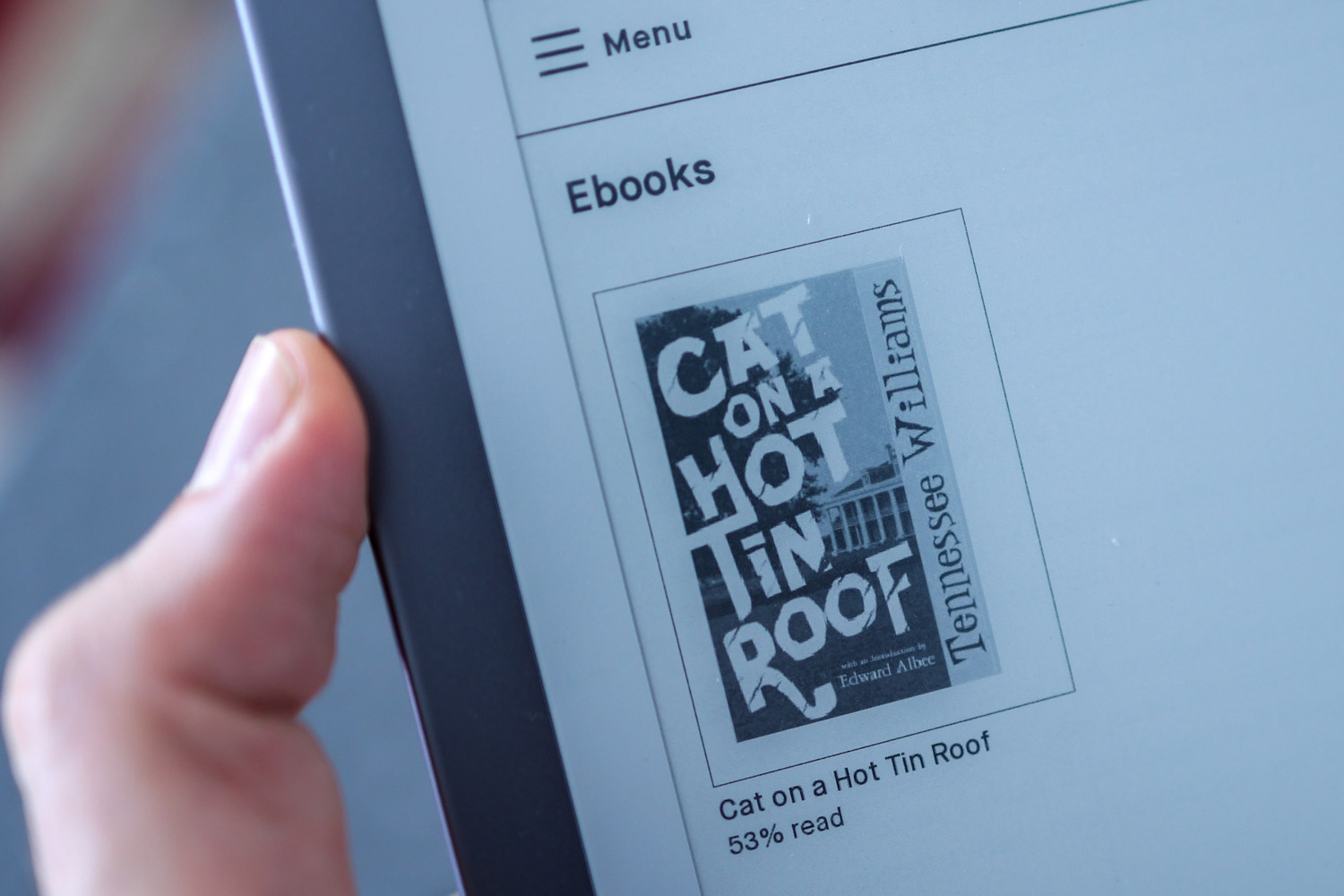
Despite these upgrades, though, there’s no getting around the fact the slate packs no app store, no backlight, no web browser, and no E-Book portal. It also runs a custom version of Linux, not Android, so you can’t easily hack apps onto it either.
So would you be better off going with a truly simple, totally pared-back notetaker like the Kindle Scribe? Should you try an app-packing, smart E Ink slate running Android like the Onyx Note Air 2 Plus? Or is ReMarkable still our E Ink champ, despite, on paper, being very long in the tooth for a piece of tech?
Design and Build: How thin?
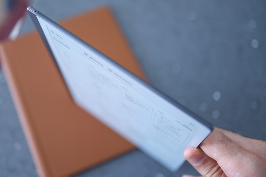
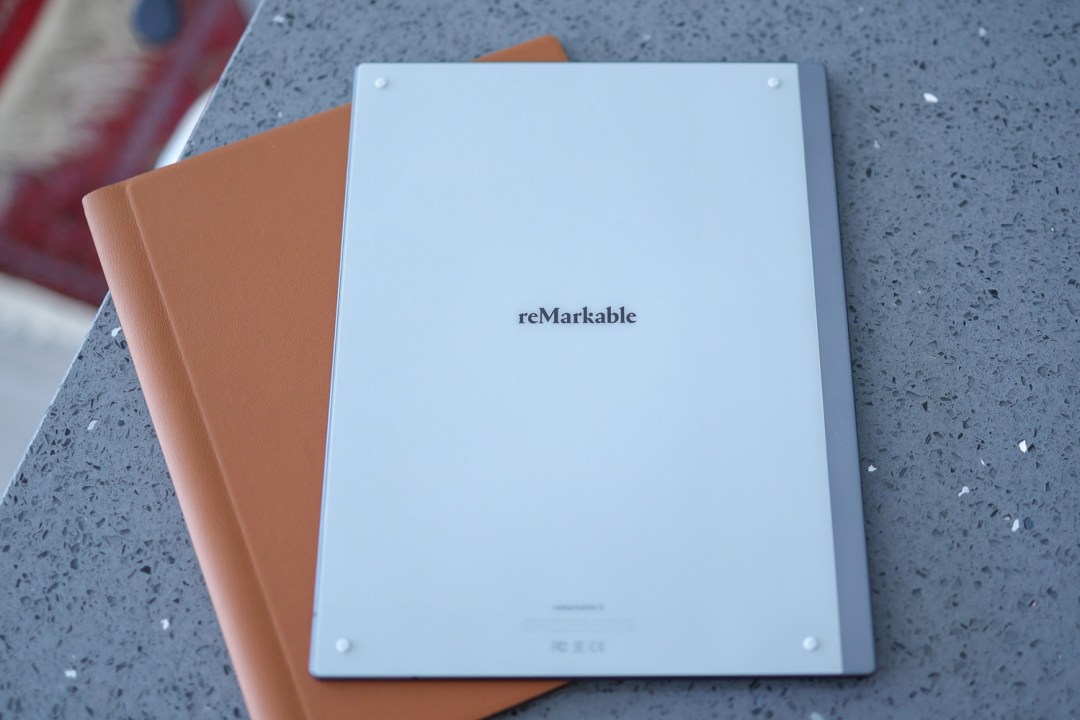
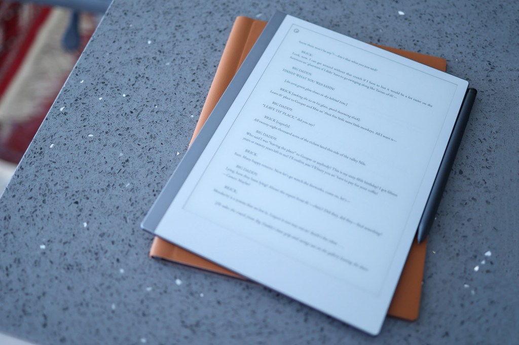
Seriously thin. That’s what springs to mind when handling the Remarkable 2. At just 4.7mm, the E Ink canvas isn’t much thicker than the USB-C port used to charge it, and the svelte body’s matched with rich styling.
A metal frame helps the Remarkable 2 feel robust, with a matte finish front and back fending off fingerprints. Rounded sides and corners mean nothing digs into your hand when holding it, and four tiny raised, rubberised discs on the back keep it in place when laid flat on a surface.
At 10in, the screen is about the same size as an iPad. There’s plenty of bezel beneath the screen, which wouldn’t look great on a traditional tab, but the Remarkable 2 gets away with it in two ways. Visually, the bezel is colour-matched to the screen’s off-white, grey tone, and practically it helps to have space to actually hold the thing. It’s especially useful when holding the tab in one hand and writing on it with the other.
A USB-C port sits at the base, opposite a power button up top. An invisible magnetic mounting point holds the optional Marker digital stylus in place. There are also pogo pins on the left side, which connect to the Type Folio keyboard cover.
Type Folio keyboard: tap happy
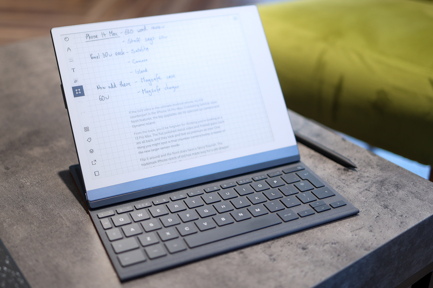
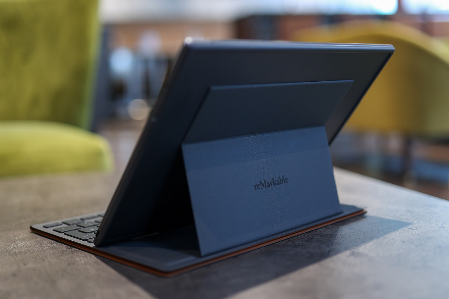
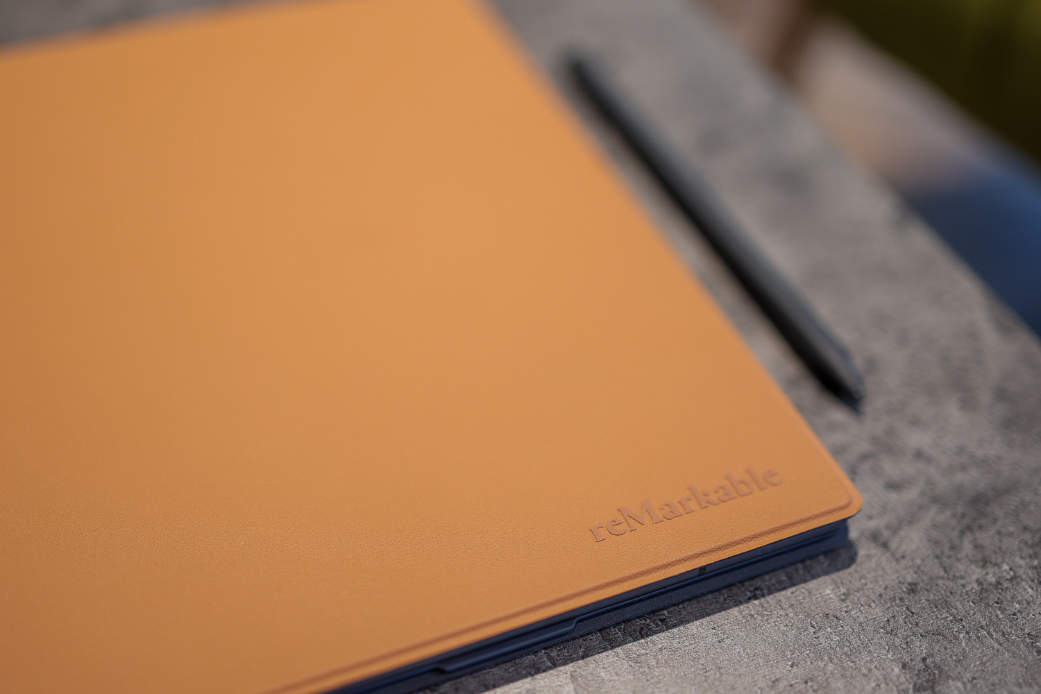
Remarkable’s Type Folio keyboard cover is worth talking about in a bit more detail, so you can consider this section a Type Folio mini-review. After all, if you’re dropping £200/$200 on an accessory, you’ll want to be sure it checks your boxes.
Firstly, the release of the Type Folio is a huge testament to ReMarkable’s commitment to continuously improving its tablet. The ReMarkable 2 was announced in March 2020 and the Type Folio has dropped a full three years later. Imagine a smartphone accessory launching three years after it was announced – we’d be pretty gobsmacked. Between Remarkable’s commitment to levelling up software and hardware, there are few brands we trust as much when it comes to upgrading an offering years down the line.
The Type Folio has an artificial leather finish and can be had in Black or Sepia (pictured). It’s seriously thin, barely thicker than the standard folio cover, and looks premium. The keyboard is actually layered behind the tab when closed. To access it, flip open the cover and rest it on a lap or surface, then lift the tablet portion. The mechanism guides the slate into a roughly 45º or 20º position, and a surprisingly usable keyboard is revealed, complete with comfortable 1.3mm travel and ample space for touch typing. The way it squeezes so much into something so sleek is, well, remarkable.
The tablet’s text entry software is less impressive, owing exclusively to its lack of flexibility. While the pen experience has been upgraded over the years, so you can select chunks of text and move them about, typed text is flowed vertically down a page in a totally linear way.
You can only input one column of text, though there is support for multiple styles. If you want to drop a few typed words here and there around the page, you can’t, so mind mapping with type isn’t possible, and managing a column of text around free-form handwritten notes can be a bit strange.
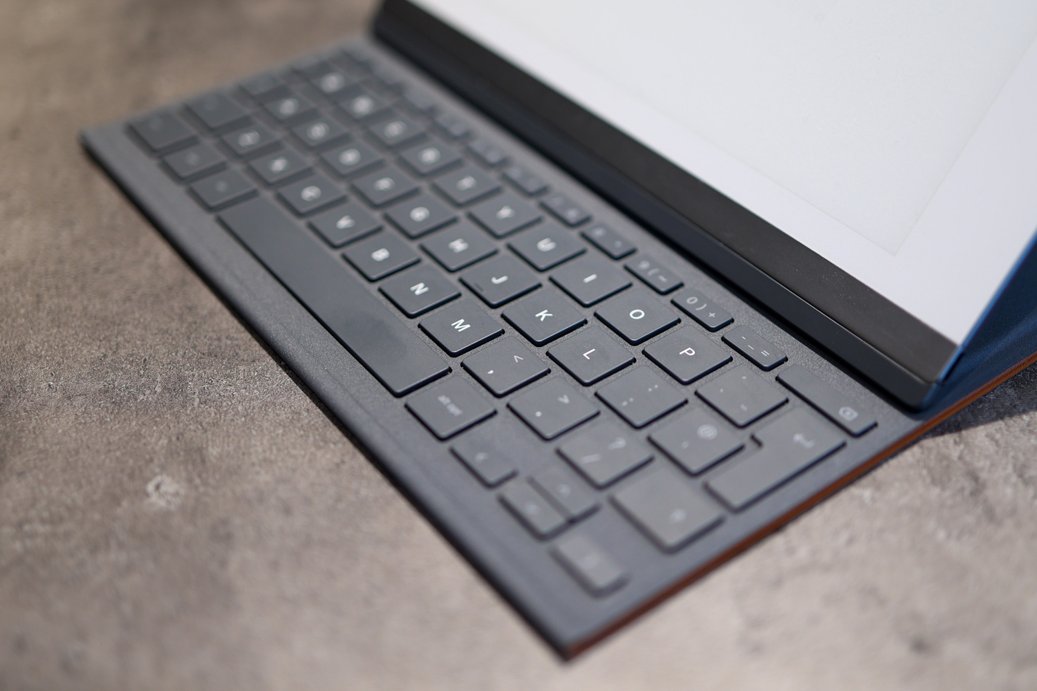
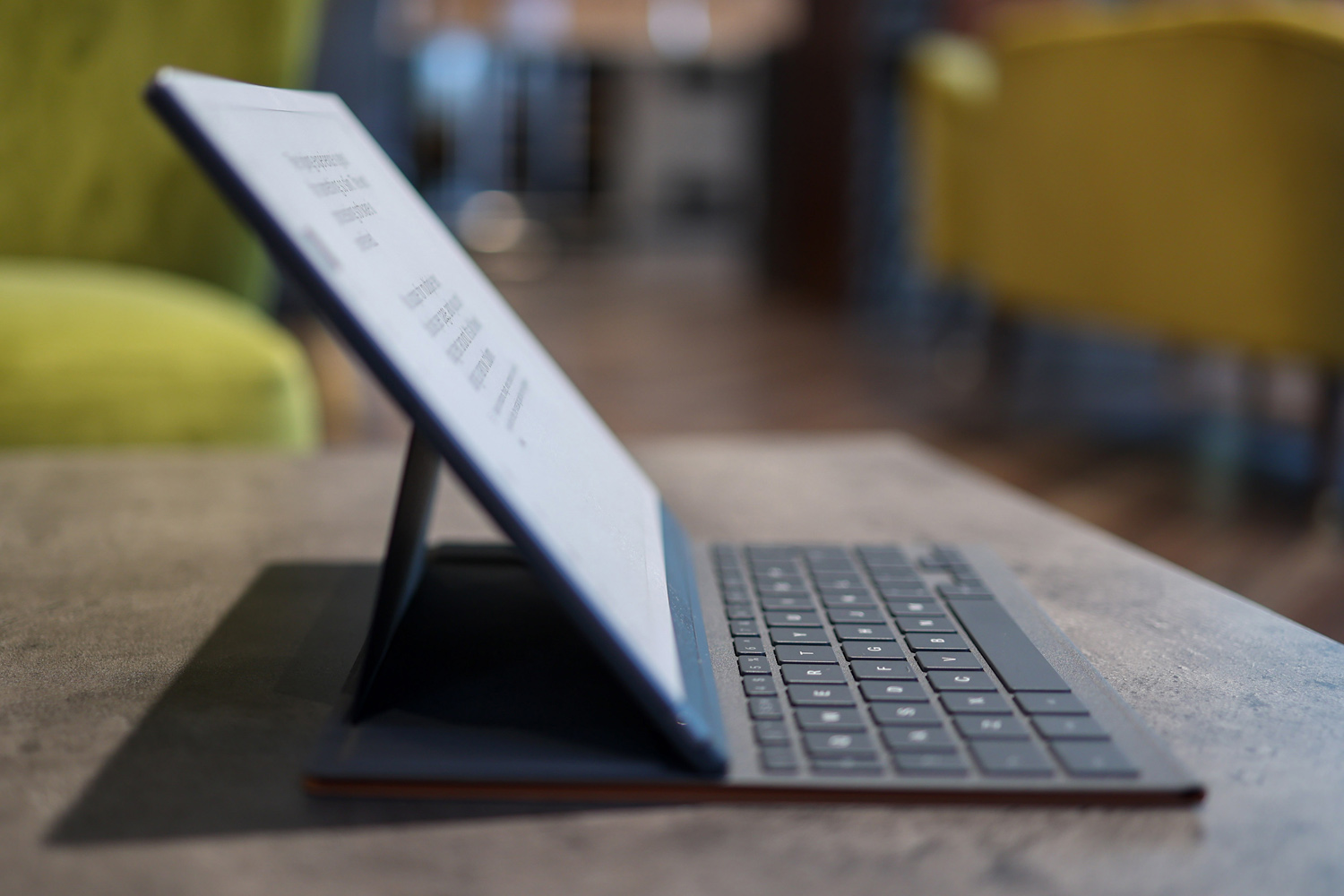
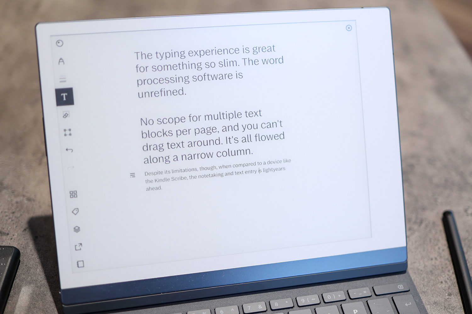
What Type Folio cover does well is offer distraction-free typing, and a space in which you can markup your copy with a pen. It’s excellent for scripts, songwriting, best-man speeches and eulogies, and thanks to its size, more usable on a plane than a laptop. It definitely found a place in our workflow.
To get your words off the tablet and into a document, you can access them on the ReMarkable mobile or desktop app and paste them across, or export your notes in a range of formats, including PDF or plain text.
If you’re looking for rich text entry with loads of customisation options, look to alternatives like the Boox Onyx Note 2 Plus with a third-party app (which is less elegant but more powerful) or a traditional tablet. That said, when compared to a super-pared back notetaker like the Kindle Scribe, the ReMarkable 2 and its TypeFolio feel like a next-gen pairing.
Accessories: Pricey but nicey
Remarkable is clearly a company that loves to labour over the details, and its products benefit from this attention. The Marker might set you back an additional £59 (or £129 for the Marker Plus) but feels excellent in the hand. Unlike the Boox Onyx pen, which is a lot more hollow, and loosely clings to the side of the tab with an underwhelming magnetism, you really get what you pay for here.
The difference between the Marker and Marker Plus is an eraser. Just use the back of the Marker Plus like you did a black and yellow lead pencil at school to rub out your pencil strokes – only now, there’s no smudging or mess. Is an eraser really worth £70? If you’re in the mood to treat yourself or a loved one, absolutely. We use the eraser every time we use the Remarkable 2 – it’s not a gimmick, but it is a luxury at the price.
There are plenty of official cases to choose from. The sleeve is a stylish grey cross-stitched polymer weave, with space for the pen and slate, which costs £69. The folio book case is also available in the same grey polymer weave for £119, and magnetically attaches to the tablet’s spine. A leather version looks and feels suitably premium, given the £159 price, but isn’t one for vegans. It’ll be interesting to see if Remarkable either refreshes the line with a vegan leather alternative, or offers one up for any potential third-gen tablet.
Screen: Canvassing notes
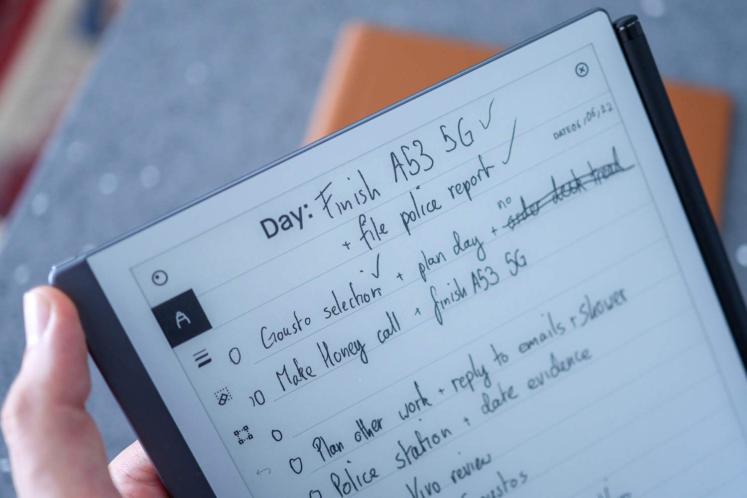
With 226 pixels crammed into every inch, the 10.3in, second-gen CANVA display is nice and sharp. It doesn’t have a backlight, so you can’t use it in the dark like the Huawei MatePad Paper and Onyx Boox Note Air 2. But that’s not a big deal in the real world, because you know what else lacks a backlight? Paper.
More important the best-in-class ghosting management and responsiveness. The multi-touch display’s diffused finish means you can see exactly what you’re doing, even in direct sunlight (we used it outdoors during a heatwave). Viewing angles are near best-in-class at a little under 180 degrees.
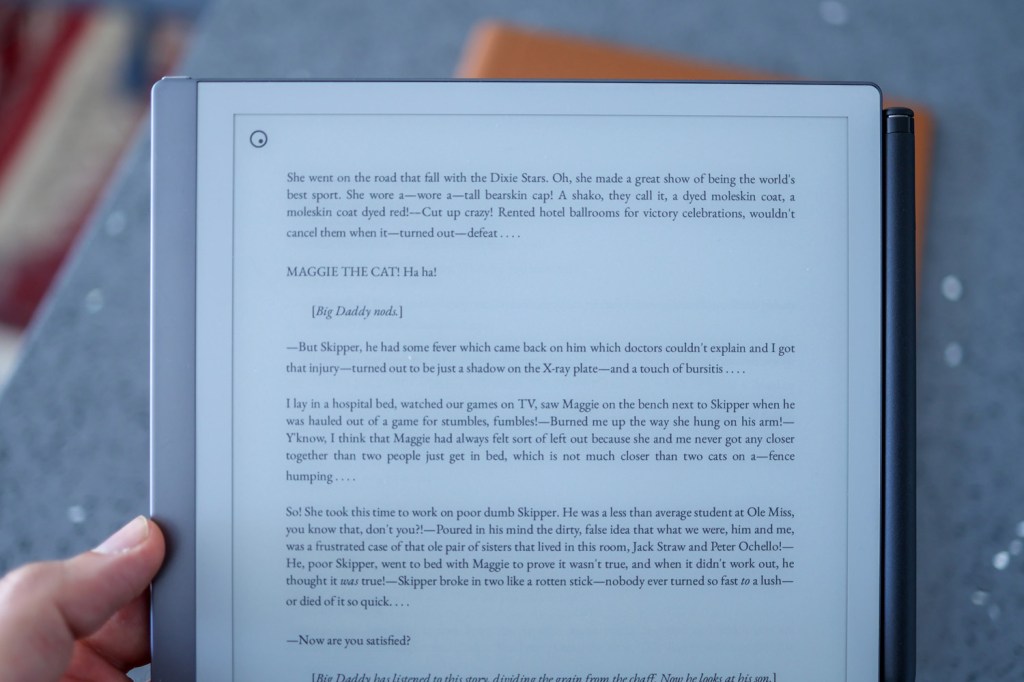
Sitting somewhere between A5 and A4 paper, the tablet is big enough for comfortable note-taking, either in your hands on on a desk. Intuitive pinch-to-zoom gestures let you work on detailed elements while sketching, or expand out to add to a mindmap. It’s supremely responsive for an E Ink display – both to the pen and finger.
Pen input: Pad of many papers
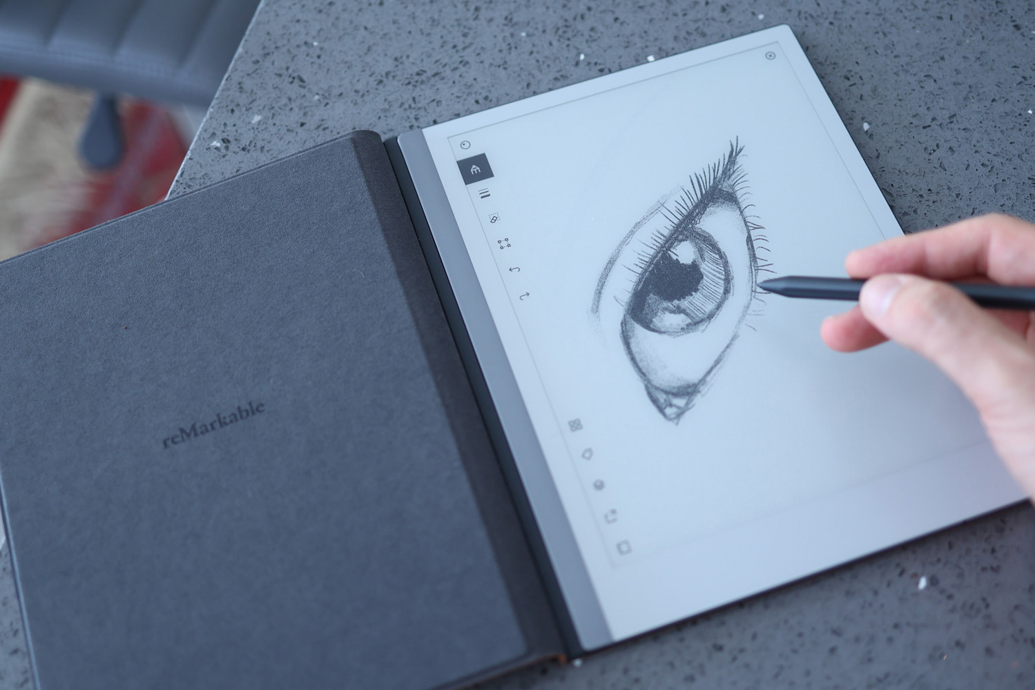
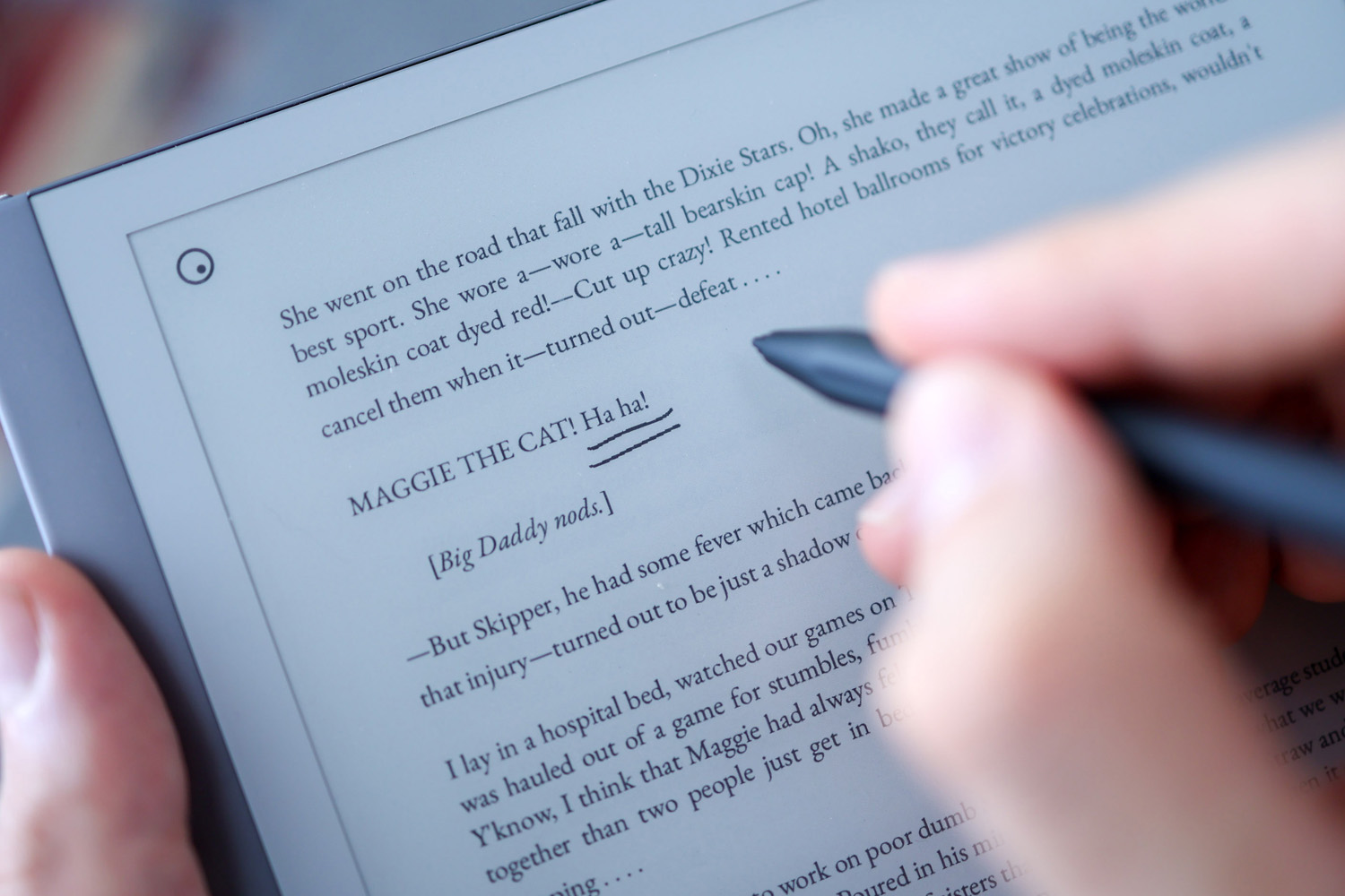
With its 4,096 levels of pressure sensitivity, the tablet’s also intuitive to write with, fleshing out the stroke as you press the pen harder against the screen. Tilt support makes shading feel intuitive, and there are plenty of pen options to choose from: ballpoint, fine liner, marker, pencil, mechanical pencil, paintbrush, highlighter and calligraphy pen.
Since its launch, the tablet has also benefited from updates that add critical features like cut and paste, and it supports up to five layers, and multiple stroke thicknesses.
While we wouldn’t pick up the Remarkable as an artists tool – it just can’t compete with the likes of an iPad Pro or Samsung Galaxy Tab S8 Ultra loaded up with Procreate or Sketchbook Pro, it’s an excellent option for more off-the-cuff sketches – we used it to storyboard a video project to great effect.
Performance and battery: tightrope tech
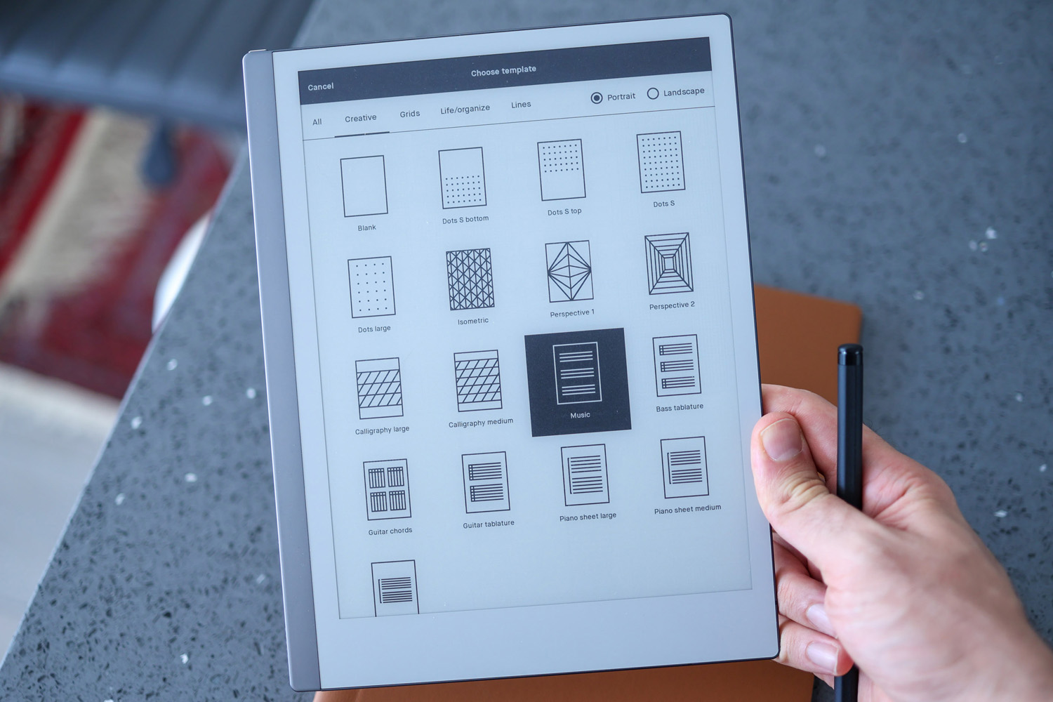
Before you start drawing or note-taking, you’re tasked with setting up a notepad. You’ll have a range of paper styles to choose from, with 51 templates split across creative, grid, life/organise and lines categories. Specific templates range from standard lined paper, music paper with seven staves per sheet, storyboarding paper and more – an excellent range.
On the reading side, only PDFs and eBooks are accessible at this stage, though they’re both rendered beautifully, with page flow handled better than both Huawei and Onyx’s default reading apps in our experience.
Cloud backup is a fairly new addition, and makes the Remarkable 2 a very different tablet to the one that launched a few years back. Connecting your device will cost you, though. Unlimited online backups start at £3.99 a month, but to access your Dropbox, Google Drive and Microsoft OneDrive folders you’ll need to stump up £5.99 a month. While OneDrive integration worked very well, Google Drive integration took about half an hour to index our files. During that time, if we tried to access Drive, our tablet froze and reset. After a successful index it worked well, but the crashes were jarring given how overwhelmingly solid the rest of the user experience is.
The pricier membership also includes an extended warranty, handwriting-to-text conversion and screen sharing, so your Android or iOS app can show whatever’s on your tablet in real time. It’s a great addition for online meetings. Even without a plan, you can still save documents as PDFs or images for quick sharing, and get files onto the tab over USB-C.
Finally, battery life. The 3,000mAh cell powering the Remarkable 2 is the same capacity as that of the Boox Note Air 2, and a bit smaller than the Huawei MatePad. Given the lack of a backlight, we expected it to last longer than the competition, but that’s not the case. You’ll get through a full work day of note-taking, or a couple of days of casual jotting in meetings and when brainstorming, but not much more.
We love how the last page we’re on lingers on-screen for 20 minutes in power saver mode, but do wish there was a more aggressive power-saving option for those intense all-nighter work days that might leave it running low by the time you clock off.
Remarkable 2 Verdict
Looking at the firm’s website, it’s clearly all about dialling back distractions. So it’s interesting the Remarkable 2 could now be on the cusp of being too smart for its own good.
The more you try and do, the more room there is for error. The Remarkable 2 is worlds away from Huawei’s MatePad Paper, whose glorious design is let down by woefully unoptimised software, but the fact we experienced issues with Google Drive integration suggests Remarkable must avoid updates that break an incredibly solid, serene and stumble-free core experience.
No other E Ink tablet touches the Remarkable 2 when it comes to the basics. It marries a premium design with a rich set of accessories, and intuitive note-taking and sketching software.
Stuff Says…
Premium design meets a polished, smart but stripped back digital notetaking experience – the best E Ink notepad and paper alternative you can buy right now
Good Stuff
Best-in-class, paper-like experience
Beautiful, impossibly thin design
Great blend of smarts go beyond a simple e-reader
Bad Stuff
Marker stylus not included
No backlight
Battery life could be better
Remarkable 2 technical specifications
| Screen | 10.3in E-ink w/ 1872×1404 resolution, 4096-level pressure sensitivity |
| Memory | 1GB |
| Storage | 8GB |
| Connectivity | Wi-Fi, USB-C |
| Battery | 3000mAh |
| Dimensions | 246×1874.7mm, 404g |

