The notch is dead! What else should Apple ditch (and keep) on iPhone?
Set fire to all of the things...apart from the ones we like!
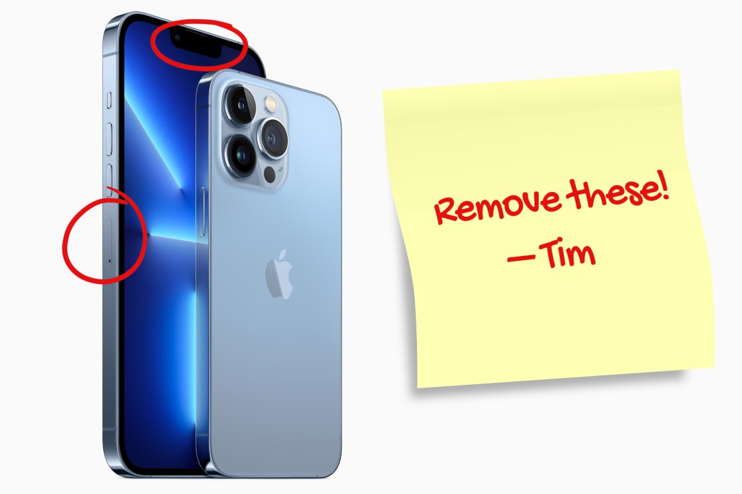
Apple announced new iPhones this week. As expected, Apple killed the notch. (Less expected: the company entertainingly turned the replacement pill cut-out into a bizarrely named feature.) It also canned the iPhone mini, and the SIM tray is history in US iPhones.
This got us thinking: what else should Apple ditch from iPhone? And what should it hang on to, rather than blazing forward to the day when every smartphone is a razor-thin rectangle with less character than the average data analyst? (Sorry, data analysts, but apparently that’s science.)
Five things Apple should remove from iPhone
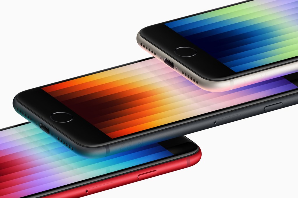
The Home button hangs around like a bad smell, wafting over from the iPhone SE. Our hope: the SE will soon be replaced by something looking like (but not called) iPhone mini, finally making every iPhone ‘all screen’.
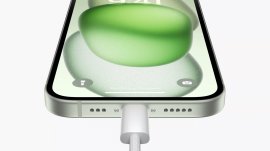
The Lightning connector was great, but it’s now an annoying outlier. Time to consign it to history and go all-in on USB-C, like everyone else. (And Apple accountants: just imagine how many dongles the company would sell!)
The SIM tray has been vanquished in the USA. It’s controversial to suggest the same should happen elsewhere, but eSIM infrastructure is solid, and this change would reduce cruft and even provide a touch more battery space.
The Home indicator lurks at the foot of the screen, bouncing around in games and immersive apps when you dare interact with them. Show it by default, but give us an off switch!
Boring colours need to get in the bin too. We’d hoped the 24in iMac would lead to Apple embracing vibrant hues. Product Red aside, iPhones have become muted and dull since the iPhone 12.
Five things Apple should keep on iPhone
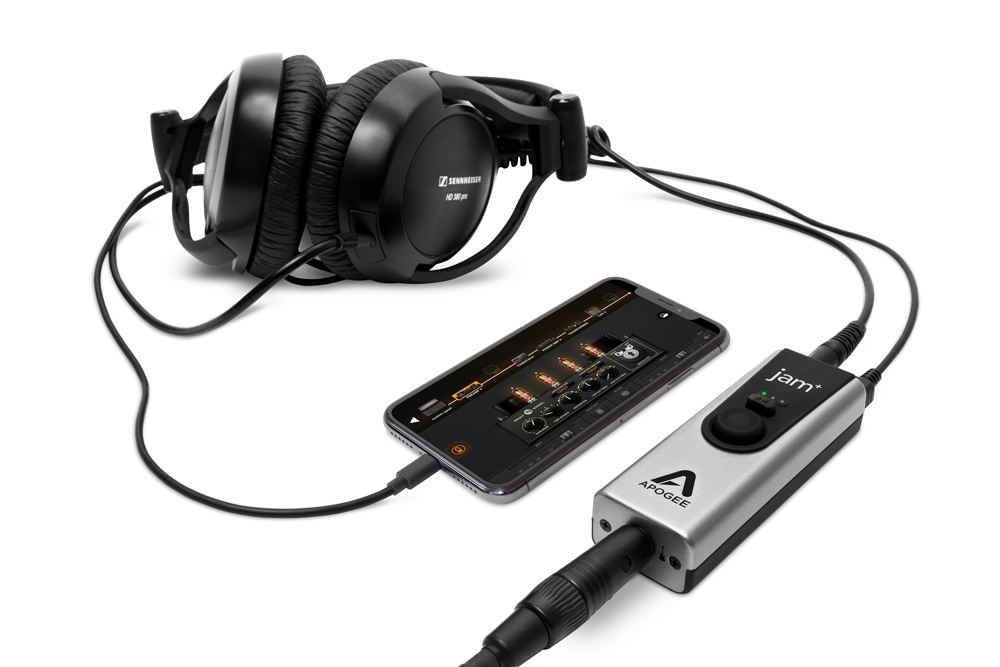
A port – but not Lightning! Rumours about Apple ditching a port entirely give us the shivers. Wireless charging is inefficient, and having a high-end phone you can’t connect instruments, mics and latency-free controllers to feels absurd.
Physical buttons might also be on the chopping block, to further ‘streamline’ iPhone. No buttons would be an accessibility and usability nightmare. There’s a reason the third-gen iPod Shuffle sits at the bottom of our best iPods list.
A small iPhone needs to stick around. We get it won’t be a premium entry again – The Guardian reports sales of smaller phones were down 35% last year – but the mini’s form factor feels like a good fit for the next SE.
Touch ID has on many modern Apple devices been dethroned by Face ID. But we’d love Touch ID to make a triumphant return as an alternative means to unlock an iPhone (under the display or integrated into the power button), since it’s fast and reliable.
Round corners need to remain, rather than a designer’s penchant for perfect rectangles deciding otherwise. In part, that’s because they make iPhone friendlier; but mostly, we don’t fancy a phone’s pointy bits jabbing us as we go about our day.


