Google Calendar made much smarter and sleeker for Android (and soon iPhone)
With Lollipop launching, Google has significantly enhanced one of its key apps

Many of us rely on Google Calendar for keeping track of our myriad appointments and obligations, but it’s an app that feels like it hasn’t evolved much over time. That’s changed as of today, at least for mobile and tablet users.
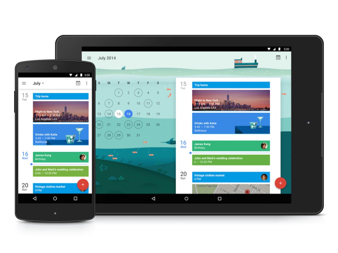
Google just rolled out a brand new version of Calendar for Android to mark the release of the first Android 5.0 Lollipop devices – and the impending spread of the OS onto existing devices – and the result is an app that’s much smarter, not to mention significantly more attractive.
The new Calendar takes the form of an assistant, so unsurprisingly, it follows a similar design and and approach as Google’s just-launched Inbox app for Gmail.
And Calendar interacts more seamlessly with Gmail now, pulling events mentioned in emails into your calendar and keeping them updated in real time. So if you have a flight ahead, the app will roll with any delays and keep you abreast of the new check-in time.
Also big is the addition of Assists (as in the Inbox app), which help you add new events by constantly suggesting the next step in the chain – whether that’s the type of event (like a birthday party), where it’s at, who it’s with, and so on and so forth, all using the rest of your Google data to fill in the missing pieces.
It’s much prettier than before, too, due to Lollipop’s touted Material Design aesthetic – but also because events in schedule view now show photos, maps, and other relevant images to show you the event’s context at a glance. It looks rather fantastic in the image up top.
Android devices running Lollipop can access the new Calendar immediately, while anyone running Android 4.1 or higher will be able to get it from Google Play in the near future. And Google says it’s also coming to iPhone at some point, though we’ll see if it’s quite as fetching in that incarnation.
[Source: Gmail Blog]


